Learn How To Build Sleek Excel Dashboards That Blow People’s Minds
- No advanced Excel skills.
- No 20 hour long course.
- No VBA or add-ins.
Imagine…
Sending your manager a dashboard and getting a reply that says “Wait, you built this in Excel?”
A client opening your file and assuming you have used some paid piece of software, and you get to say “no, just Excel”, and watch their face change.
Finally producing work you’re proud to put your name on – in front of your team, on LinkedIn, in your portfolio, or in front of your next employer.
Have you ever seen a dashboard like the one above and thought:
“How is THAT Excel?”
Most Excel dashboards look the same…
And the frustrating part?
The analysis underneath might actually be brilliant.
Your formulas can be right.
Your analysis can be smart.
Your insights can be genuinely useful.
But people experience all of that through the way you present it.
And when your dashboard looks like every other spreadsheet they’ve opened that week…
Your work feels like every other spreadsheet they’ve opened that week.
You finish the report.
Send it across.
Maybe get the polite “looks good”…
And a week later, it’s buried somewhere in a shared drive.
So you decide to make the next one better.
You remove the gridlines.
Change a few colours.
Add some rounded rectangles.
Maybe copy a KPI card you saw on LinkedIn.
Then you head to YouTube. And there’s no shortage of Excel tutorials:
Add a slicer here.
Change a chart colour there.
Use this trick to create a fancy button.
So you start collecting tricks.
But nobody shows you how the pieces fit together.
- What should you build first?
- How should the page actually be structured?
- Which colours work together?
- How do you make charts feel like they belong to the same dashboard?
- How do you add navigation without turning the workbook into a mess?
- And how do you make the whole thing feel intentional rather than like a spreadsheet you’ve decorated?
So a few hours later…
You’ve learned five new Excel tricks.
But your dashboard still looks like a spreadsheet.
And eventually you start thinking:
“Maybe I just don’t have the design eye for this”
But what if it’s not your design eye at all?
It’s not that you lack a design eye.
And it’s definitely not that you need another fifty disconnected Excel tricks.
You’re simply building things in the wrong order.
Most people start with the data.
- They build a chart. Then another.
- Squeeze in some slicers wherever there’s space.
- Add a title.
- And pick the colours right at the very end.
Every new piece gets wedged in around the last one…
Which is exactly why the finished dashboard feels decorated rather than designed.
That’s not a talent problem. It’s what happens when you learn Excel one feature at a time.
Because most Excel tutorials teach you individual features.
A chart.
A slicer.
A KPI card.
A button.
Each one taught on its own, and usually left in Excel’s default design.
But a sleek dashboard doesn’t come from any one of those things.
It comes from knowing how to structure them together as one interface.
- The layout
- The hierarchy
- The containers
- The colours
- The charts
- The navigation
All working together.
And once you understand a few simple structural moves, in the right order, something strange starts to happen…
Your spreadsheet stops looking like a spreadsheet.
And starts feeling like a web app.
And no, you don’t need to become an Excel wizard to do this
If you’re looking at the dashboard above thinking there must be some complicated trick behind it…
There isn’t.
- No VBA.
- No macros or add-ins.
- No design degree.
- No need to learn Power BI.
And for the record, I don’t have a design degree either. By day I’m a consultant working on energy models, not a designer.
Fraser Alexander
Everything you’re looking at is built using standard Excel features you already have sitting in front of you.
The difference isn’t knowing hundreds of advanced Excel functions.
It’s knowing what to do with the simple tools Excel already gives you.
- A few simple design principles.
- A better way to structure the page.
- Some clever uses of shapes, charts and native controls.
- And a system for putting them together so the finished dashboard feels like one polished interface rather than a collection of Excel objects.
So if your company insists on Excel…
Your client needs the final file in Excel…
Or you simply don’t want to spend the next few months learning an entirely new piece of software…
Good.
You don’t need to leave Excel behind.
You just need to stop using it like everyone else does.
So… who am I to teach you this?
I’m Fraser Alexander, a 2025 Global Excel Awards finalist.
And I didn’t get interested in Excel because I wanted to memorise hundreds of formulas.
I became slightly obsessed with one question:
“How far can you actually push Excel?”
It started a few years ago when I was leading the development of a dashboard for a client who was absolutely set on using Excel.
No Power BI. No shiny new software.
It had to be Excel.
Around the same time, I watched another company present some software to us.
The software itself wasn’t what stuck with me.
The presentation was.
Everything was beautifully structured, perfectly aligned to our branding and deliberately designed.
And I remember thinking:
“They haven’t changed what they’re selling.They’ve changed how valuable it feels.”
That was the lightbulb moment.
Why couldn’t I do the same thing with my work in Excel?
So I started experimenting with the design capabilities already built into Excel, approaching the workbook more like a UI designer building an interface than somebody formatting a spreadsheet.
And eventually I took that approach back to the client dashboard.
And when I presented it…
They initially thought I hadn’t built it in Excel.
There was actually a slightly awkward moment where they reminded us that Excel was a contractual requirement.
I had to open the ribbon and show them:
“Look, it really is Excel.”
Once they realised it was…
They couldn’t believe it.
And neither could my team.
That experience changed the way I approached Excel completely.
So I started sharing what I was building
I began posting some of my Excel UI experiments on LinkedIn.
Dashboards built entirely in Excel, but deliberately designed to feel more like modern software.
And the reaction surprised me.
One post alone reached 687 reactions and 305 comments.
If you think Power BI looks better than Excel check this out…
Posted on LinkedIn, 2 Dec 2024
- 687 reactions
- 305 comments
- 24 reposts
Another Power BI recreation in Excel…
Posted on LinkedIn, 28 Jan 2025
- 410 reactions
- 55 comments
- 13 reposts
2.2 million rows. Web-App Design. Built in Excel…
Posted on LinkedIn, 26 May 2026
- 203 reactions
- 49 comments
- 7 reposts
And again and again, I’d get some version of the same reaction:
“Wait… you built that in Excel?”
- Richard NeroLinkedIn message
Microsoft Excel MVP
Bro your post today was wild!! hahaa.. that thing is so cool.
Its mad that you have just come on the scene and created some of the best Excel stuff I have seen in a while.
- Zsolt SzabóLinkedIn comment
Power BI creator
It looks great and Im still impressed, that this is possible in Excel :D
Real messages and comments from LinkedIn.
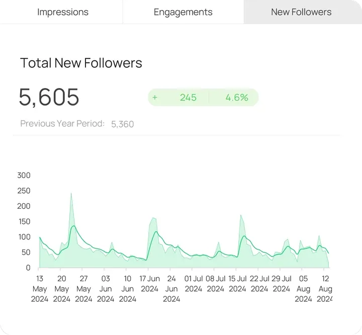
Today, around 5,000 people follow my Excel work on LinkedIn.
The more I shared, the clearer it became:
There were a lot of Excel users who wanted their work to look better…
…but very few people were showing them how to put all the pieces together.
Not another isolated chart trick.
Not another fancy formula.
A repeatable way to actually design the whole thing.
And in 2025, my work was recognised by the Excel community
I was named a Global Excel Awards Finalist: Rising Star in the Excel Industry.
But here’s the important part…
You don’t need to spend years figuring this out the way I did.
- I’ve taken the techniques that made the biggest difference…
- Removed the unnecessary complexity…
- And organised them into a simple, step-by-step process, in the right order, that transforms an ordinary Excel dashboard into something that looks clean, modern and genuinely professional.
Which is exactly what I’m going to show you inside…
Introducing…
The Sleek Excel Method
A focused, 3-part video course that shows you how to build an interactive Excel dashboard that feels like a modern web app.
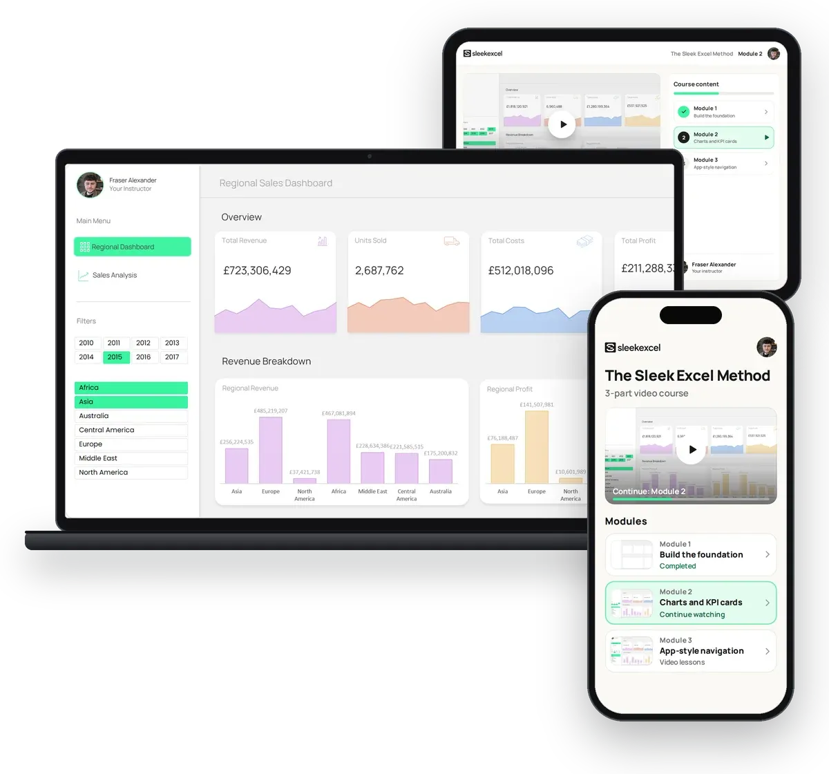
Just the parts that change how your dashboards look and feel, without sitting through 20 hours of formulas and features you’ll probably never use.
Together, we’ll build the exact dashboard you’ve seen throughout this page, step by step, using standard Excel features.
It starts with a blank visual foundation…
Then we transform the charts and KPI cards…
And finally, we bring everything together with smooth, app-style navigation.
By the end, you won’t just have watched me build a dashboard.
You’ll understand the design system behind it, so you can apply the same principles to your own work.
- Step-by-step video lessons
- Watch on any device
- Works in Excel for Windows and Mac
- Go at your own pace
- Lifetime access
Here’s exactly what you’ll learn
-
Module 1
Build the foundation everything else sits on
Make Excel stop looking like Excel before you’ve touched your data or created a single chart.
Most people throw charts onto a worksheet and try to make everything look good afterwards. That’s the wrong order.
We’re going to do the opposite.
In Module 1, you’ll build the visual foundation first: the structure, hierarchy and design system that make everything you add afterwards look polished straight away.
Inside this module, you’ll learn:
- The simple page structure I use to turn a blank worksheet into a clean dashboard interface, before a single chart goes on it
- How to use spacing, containers and hierarchy so the page looks deliberately designed, not randomly assembled
- A no-guesswork way to choose and apply a colour system, even if you don’t trust your “designer’s eye”
- How to turn your foundation into a reusable starting point, so you never start a dashboard from a blank sheet again
-
Module 2
Turn Excel’s default charts into visuals people actually want to look at
Excel’s default charts are functional. They’re just not particularly exciting.
In Module 2, you’ll take the charting tools already built into Excel and make them clean, modern and consistent with the rest of your interface.
Inside this module, you’ll learn:
- How I transform default Excel charts into clean, professional visuals without rebuilding everything from scratch
- The KPI card layout that puts the number first, and exactly what to strip away so it reads at a glance
- How to use colour so your charts guide attention instead of fighting for it
- How to make your charts and KPI cards interactive, using nothing but standard Excel
-
Module 3
Build silky-smooth navigation that feels like a web app
Turn separate Excel sheets into one connected dashboard experience.
This is the part that makes people ask: “Wait… how did you do that in Excel?”
Instead of clicking through worksheet tabs like a traditional spreadsheet, you’ll connect your dashboard so it behaves like a modern app.
Inside this module, you’ll learn:
- How to build clean, intuitive navigation so users always know where they are and where to go next
- How to connect multiple dashboard pages into one seamless experience
- The app-style interactions that make an ordinary workbook feel completely different
- How to bring it all together into the finished dashboard you saw at the top of this page
Why you’ll be paying less for this course
Here’s the honest version.
The full price for The Sleek Excel Method is $97, and that’s what it will cost soon.
Right now, this is a beta launch.
In return for the lower price, I’m asking beta students for honest feedback, so I can improve the course before it goes to full price.
I want the people who join now to actually finish it, actually build Excel dashboards they’re proud of, and actually tell me it worked.
Once the beta students have been through it, the price goes up to $97.
Full price $97
Beta price
- One-time payment
- Lifetime access

Plus, you’ll be backed by my unconditional money-back guarantee
You don’t have to be sure right now.
Get access, work through the modules, and try it for 30 full days.
If it’s not for you, send one email to fraser@sleekexcel.com and you’ll get every penny back, with your refund processed within 24 hours.
No questions asked.
“You either love what you create… or you don’t pay for it.”
And to help you go even further…
Get 3 bonuses when you join today
-
Bonus 1
Valued at
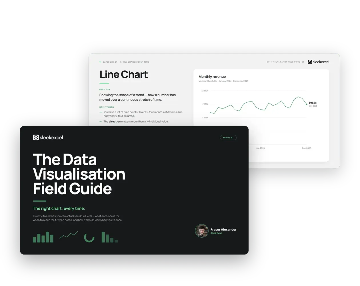
$17FREEThe Data Visualisation Field Guide
A visual handbook covering 25 chart types you can actually build in Excel
Pick the right chart, every time, and know exactly why it’s right.
This is the one you’ll keep open every time you build:
“Wait… which chart even fits this?”
Instead of defaulting to whatever Excel suggests first, you’ll flick it open before you build anything and match the chart to the question your data is actually answering.
Inside this bonus, you’ll learn:
- Which chart fits which question (comparison, trend, composition, performance), so you stop guessing and start choosing
- Which of the 25 chart types earn a place on a dashboard, and which ones to leave out entirely
- How to take Excel’s default chart and turn it into something that looks intentional, every time
-
Bonus 2
Valued at
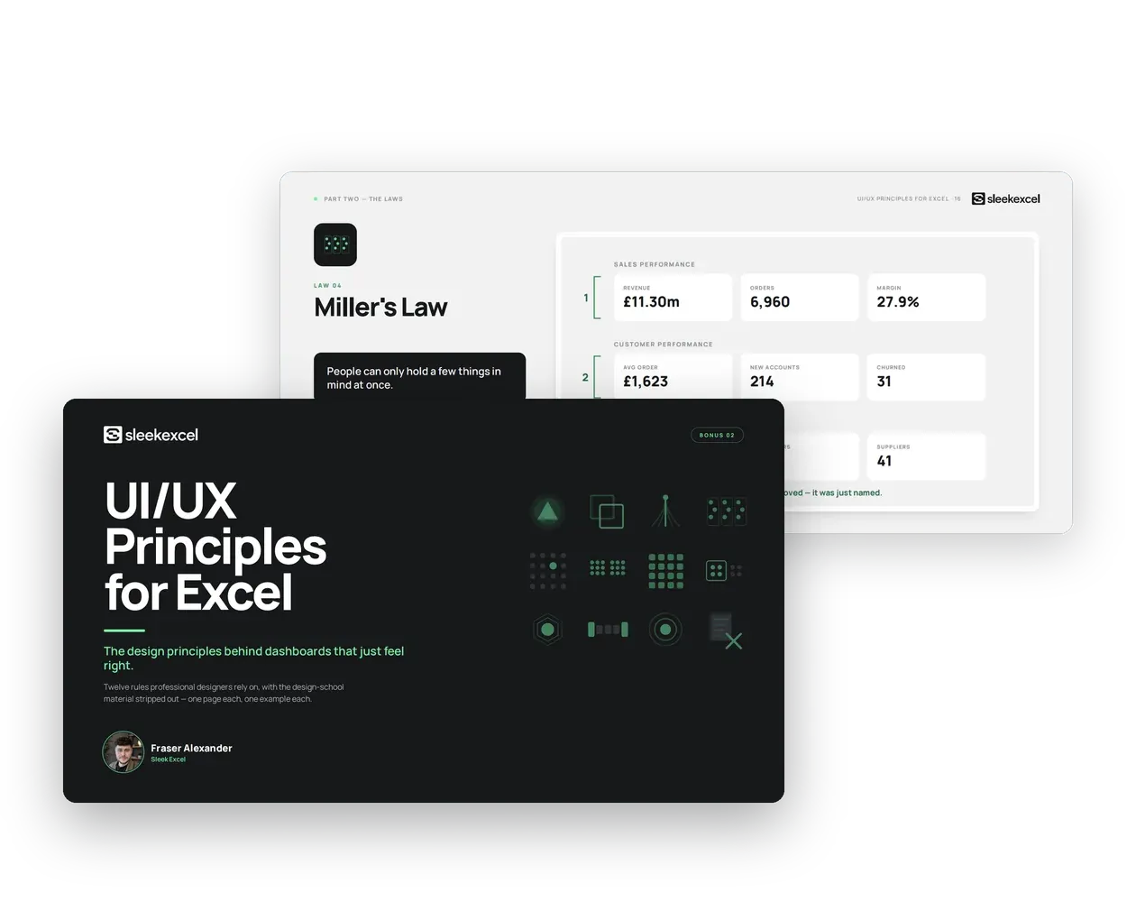
$22FREEUI/UX Principles for Excel
A design handbook: 5 visual foundations and 8 UX laws, one page each
Learn the design rules that make a dashboard feel right, not just look nice.
This is the one that finally answers:
“Why does that layout work, and mine doesn’t?”
Once you know the answer, you stop guessing, on this dashboard or the next fifty. You’ll have the small set of principles (hierarchy, spacing, alignment, typography and colour) that decide whether a dashboard feels calm and obvious or cluttered and confusing.
Inside this bonus, you’ll learn:
- The five visual foundations behind every dashboard that feels designed rather than defaulted
- The 8 UX laws real software products are built on, applied specifically to Excel
- How to look at your own dashboard and spot exactly what’s wrong with it, not just that something feels off
-
Bonus 3
Valued at
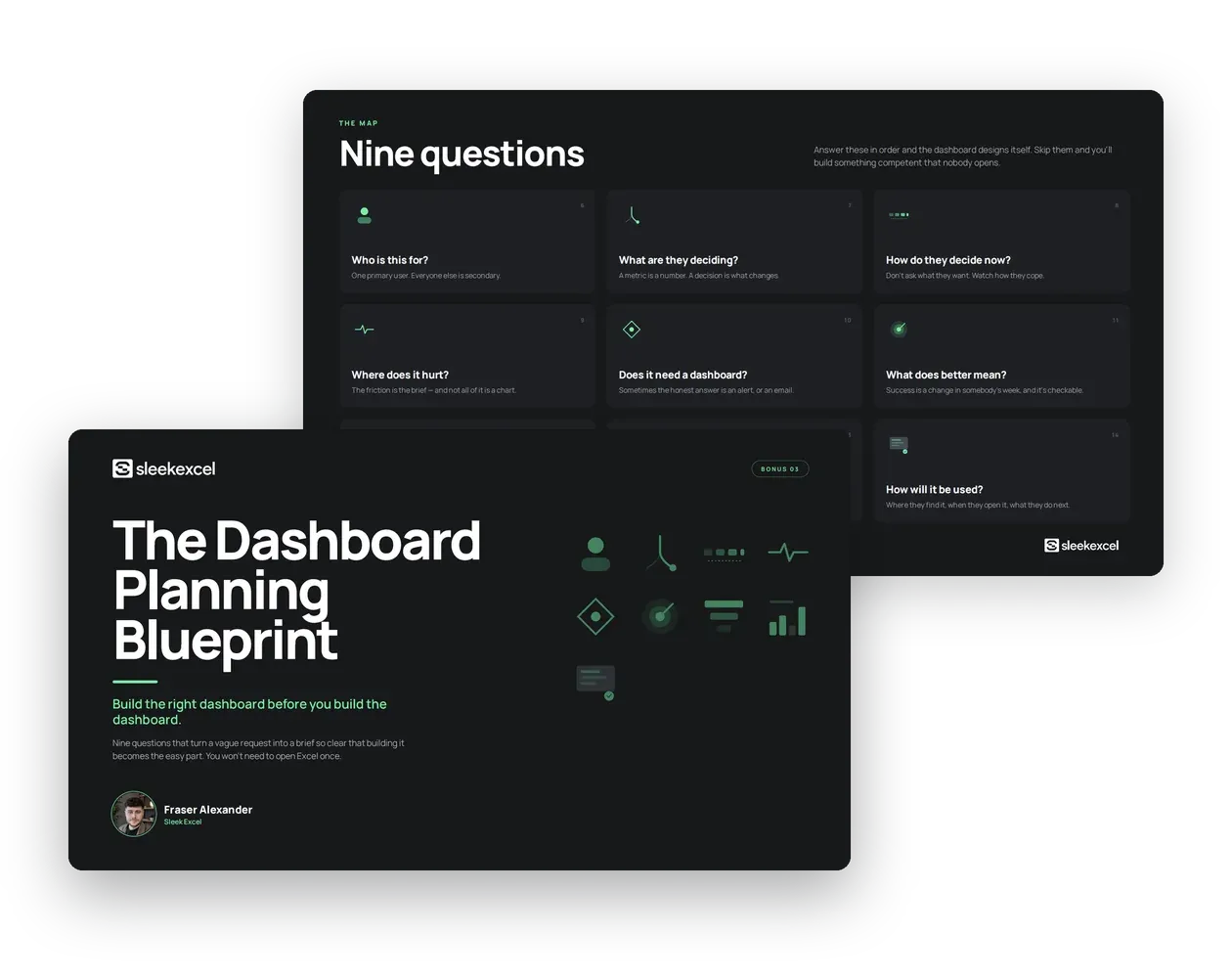
$24FREEThe Dashboard Planning Blueprint
A planning workbook built around nine simple questions
Know exactly what to build before you open Excel.
This is the one you’ll use on every dashboard request you ever get:
“Should this even be a dashboard?”
Instead of starting from “here’s the data I’ve got” and hoping a decision falls out of it, you’ll work through nine simple questions that turn a vague ask, like “Can you build us a sales dashboard?”, into a one-page brief: who it’s for, what decision it supports, and what you’re deliberately leaving out.
Inside this bonus, you’ll learn:
- How to turn a vague request into one sentence naming the real decision it needs to support
- A simple test for telling a genuine dashboard need apart from an alert, a scheduled report, or a data problem wearing a dashboard’s clothes
- How to walk out of any planning conversation with a finished one-page brief you can hand straight to Module 1, or to a client
Here’s Everything You’re Getting
The course shows you how to build it. The bonuses cover which chart to use, why the design works and what to build. It’s all yours to keep.
The Sleek Excel Method
How to build it. Take the Regional Sales Dashboard from a blank sheet to a finished, clickable dashboard in three self-paced video modules.
The visual foundation Structure, hierarchy and a colour system you reuse on every dashboard
Charts and KPI cards Eye-catching visuals that make the numbers readable at a glance
App-style navigation Connect your dashboard views so it feels like a web app
Plus 3 bonuses, free with the course
Bonus 1
Value $17Free
The Data Visualisation Field Guide
Which chart to use. 25 chart types, each with when to use it, when to avoid it and a design tip to make it look sharp.
Bonus 2
Value $22Free
UI/UX Principles for Excel
Why the design works. 5 visual foundations and 8 UX laws, each shown on a side-by-side dashboard example.
Bonus 3
Value $24Free
The Dashboard Planning Blueprint
What to build. 9 questions that turn a vague request into a one-page plan before you open Excel.
Total value
$160
Beta launch price
Total value $160
Beta price 47 US dollars
- One-time payment
- Lifetime access
But why stop here?
Sometimes you don’t need a whole dashboard. You just need to report a few key numbers, in a way people actually notice.
The Interactive KPI Card
When I shared it on LinkedIn
People asked for the file. Now it comes free with the course.
Click a tab to switch metric, pick a period, and the headline number, the change against last year and the chart all update together.
- The finished Excel file, ready to reuse in your own reports
- 3 metrics and 6 time periods, all one click away
- Plain .xlsx file, no macros
Including Everything So Far
The course and all 4 bonuses, for one price. It’s all yours to keep.
The Sleek Excel Method
How to build it. Take the Regional Sales Dashboard from a blank sheet to a finished, clickable dashboard in three self-paced video modules.
The visual foundation Structure, hierarchy and a colour system you reuse on every dashboard
Charts and KPI cards Eye-catching visuals that make the numbers readable at a glance
App-style navigation Connect your dashboard views so it feels like a web app
Plus 4 bonuses, free with the course
Bonus 1
Value $17Free
The Data Visualisation Field Guide
Which chart to use. 25 chart types, each with when to use it, when to avoid it and a design tip to make it look sharp.
Bonus 2
Value $22Free
UI/UX Principles for Excel
Why the design works. 5 visual foundations and 8 UX laws, each shown on a side-by-side dashboard example.
Bonus 3
Value $24Free
The Dashboard Planning Blueprint
What to build. 9 questions that turn a vague request into a one-page plan before you open Excel.
Special bonus
Bonus 4
Value $34Free
The Interactive KPI Card
When you just need the key numbers. The card from my LinkedIn post that got 687 reactions and 305 comments, as a finished file you can reuse.
Total value
$194
Beta launch price
Total value $194
Beta price 47 US dollars
- One-time payment
- Lifetime access
Still got questions?
Straight answers to the things you might be wondering before you join.
Can’t see your question?
Email fraser@sleekexcel.com and I’ll get back to you personally.
Do I need advanced Excel skills to start?
No. Module 1 assumes you’re starting from zero and builds everything up step by step. If you’ve tried building a dashboard before and it didn’t go well, that’s fine too. We’ll fix the habits that caused it.
What will I actually build?
The Regional Sales Dashboard from the video at the top of this page. You take it from a blank sheet to a finished dashboard, with eye-catching charts, KPI cards and app-style navigation between views.
Will it work on a Mac?
Yes. Everything is built with native Excel features, with no VBA, macros or add-ins, so it works on Windows and Mac.
How much time does this actually take?
Most students get through each module in a couple of hours, at their own pace. There’s no schedule to keep up with, so you can fit it around work.
How is this different from free YouTube tutorials?
YouTube is great for single tricks, but nobody shows you how they fit together. This course takes you through one complete dashboard in the right order, from structure to charts to navigation, so the finished result looks designed rather than decorated.
Can I use this on my own reports?
Yes. The Regional Sales Dashboard is the worked example, but what you’re really learning is a method. The structure, colour system and components are built to be reused, so you can apply them to whatever you build next.
How long do I have access?
Forever. It’s lifetime access, with no subscription and no expiry date.
Is this a one-time payment?
Yes. You pay once, with no subscription and no recurring charges.
What if I don’t love it?
You’re covered by the 30-day money-back guarantee. Email fraser@sleekexcel.com and you’ll get a full refund, processed within 24 hours. No hoops to jump through.
What if I get stuck or have a question?
Email fraser@sleekexcel.com any time. This is a small course, not a faceless platform, so you’ll get a real answer from me, not a support ticket queue.
Can’t see your question?
Email fraser@sleekexcel.com and I’ll get back to you personally.
If you’ve read this far, you’re likely ready.
Let’s go.
Total value $194
Beta price
47 US dollars
- One-time payment
- Lifetime access